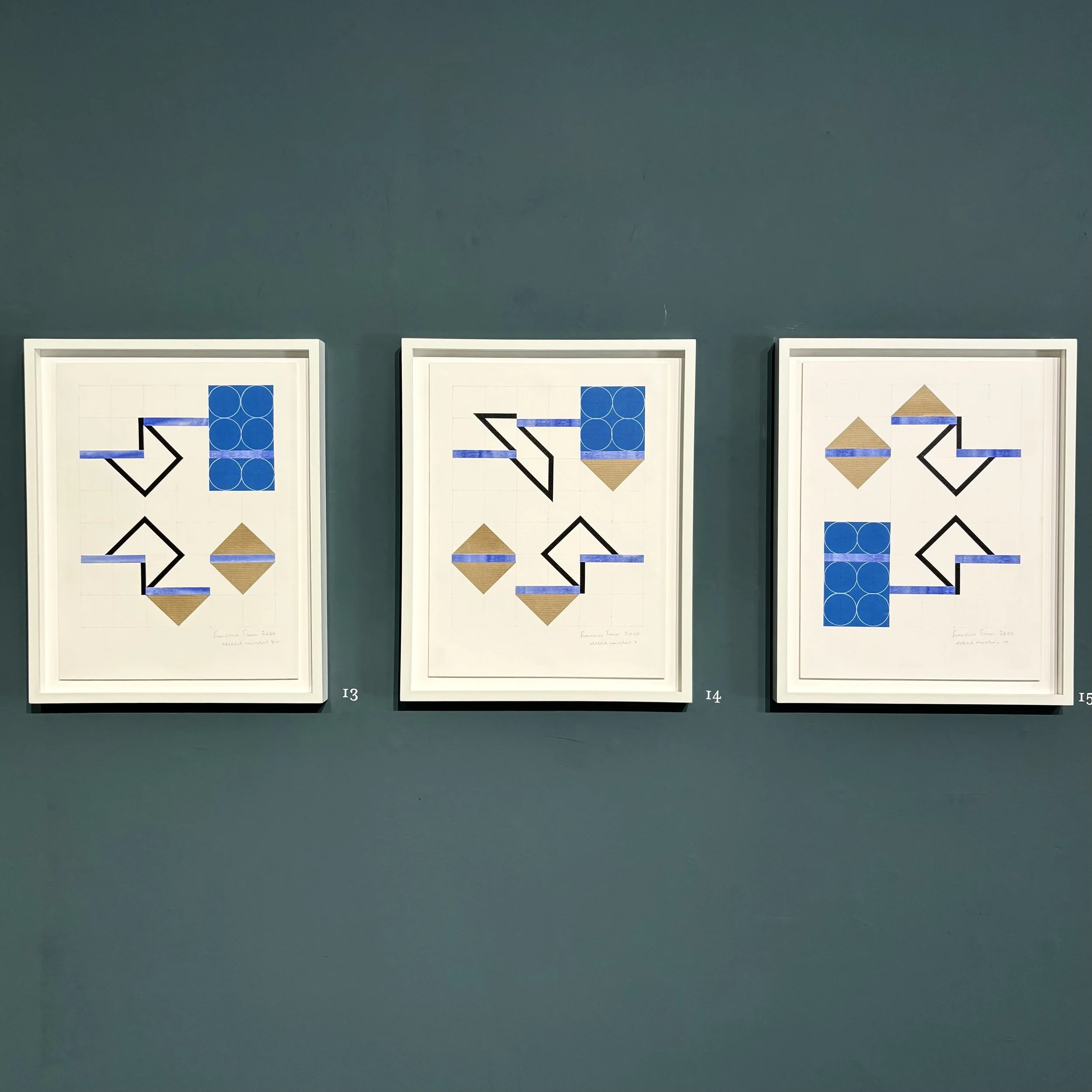
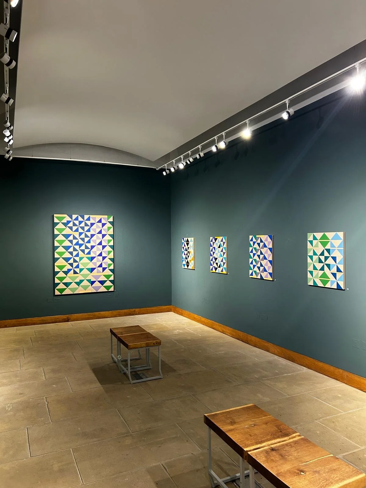
2025 THE SPACES BETWEEN, PLATFORM A, MIDDLESBROUGH AND RYEDALE FOLK MUSEUM, HUTTON-LE-HOLE
Photography @racheldeakin_
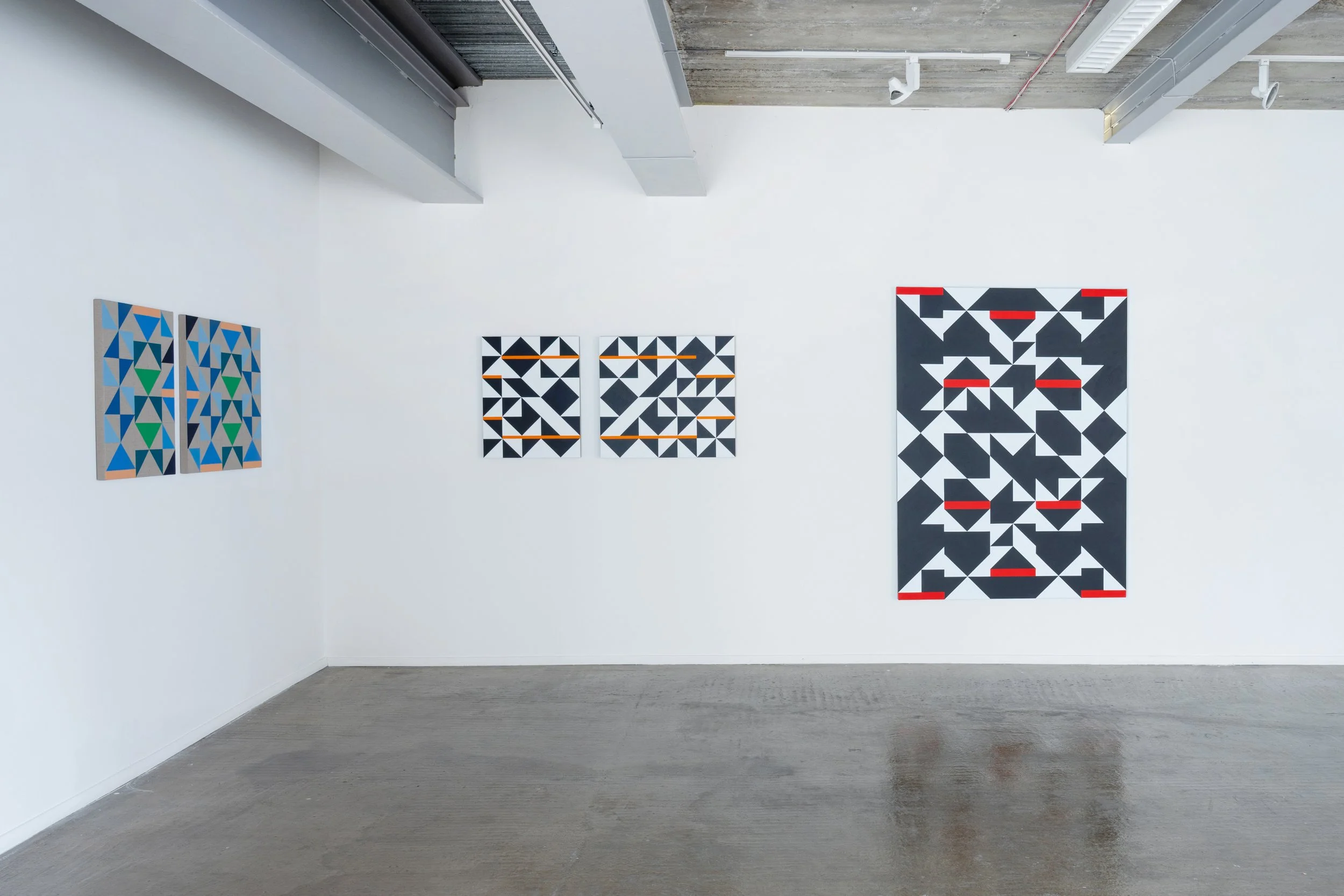
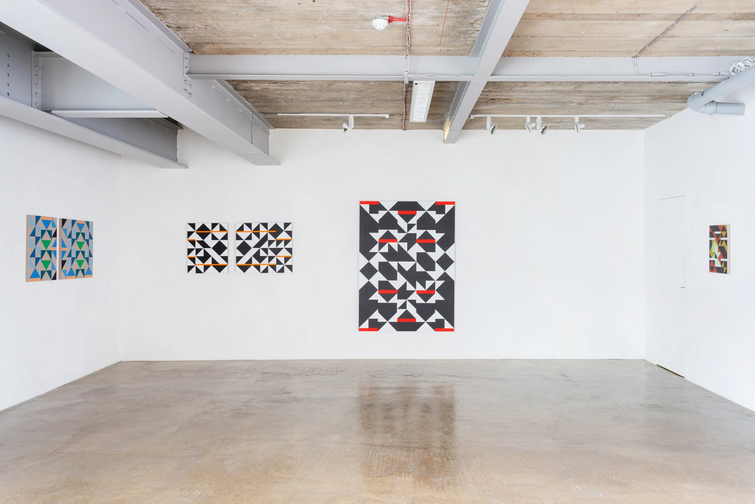
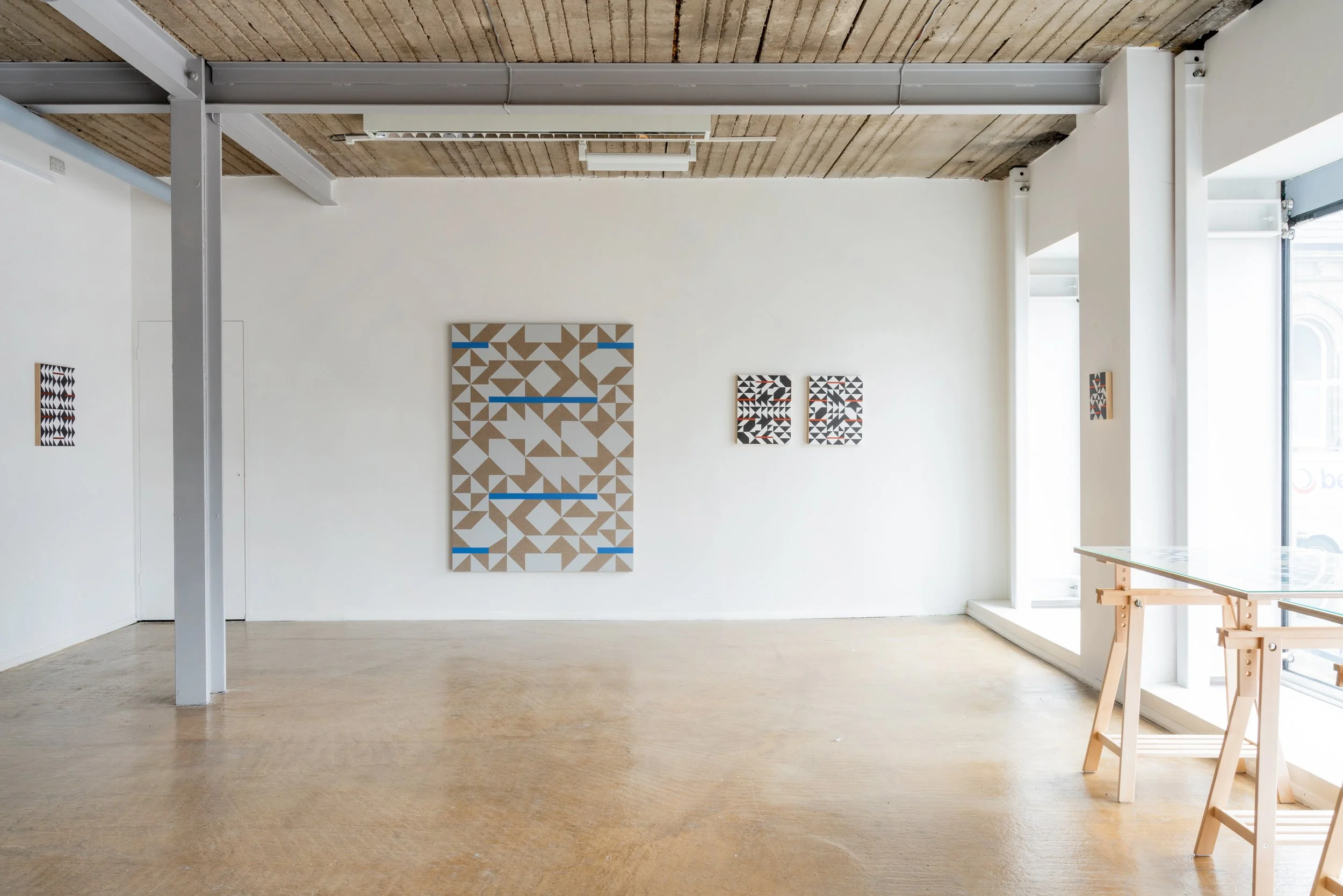
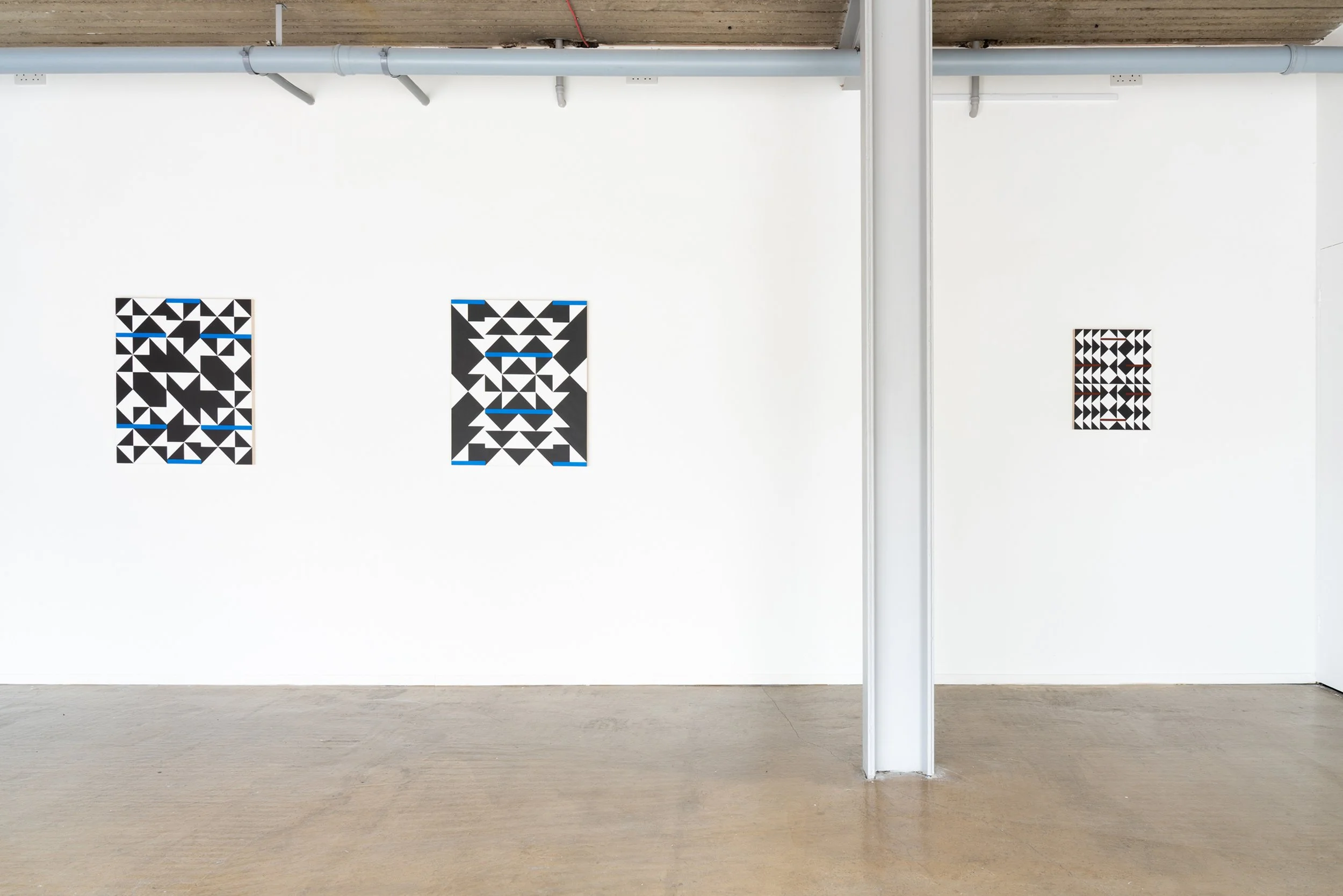
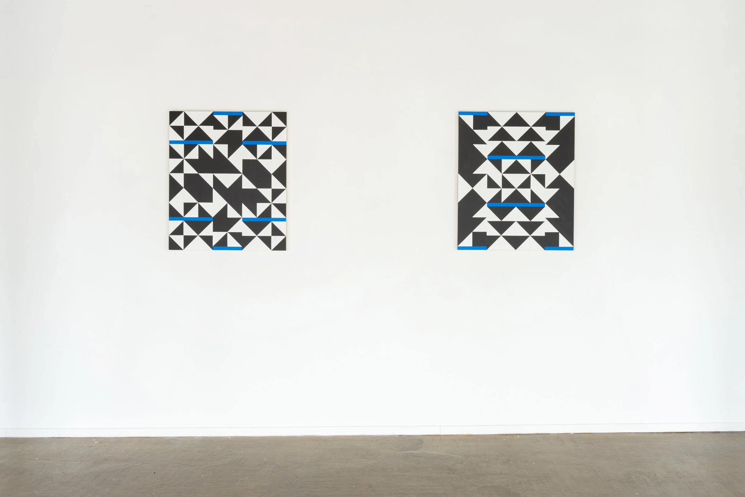
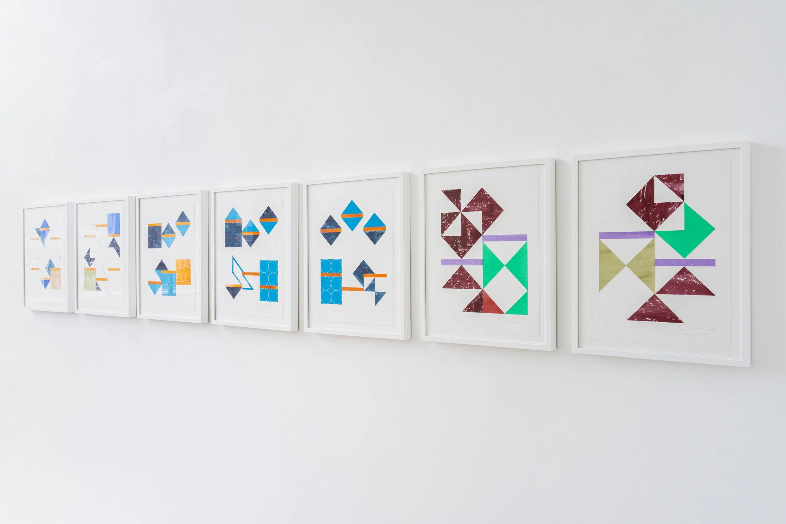
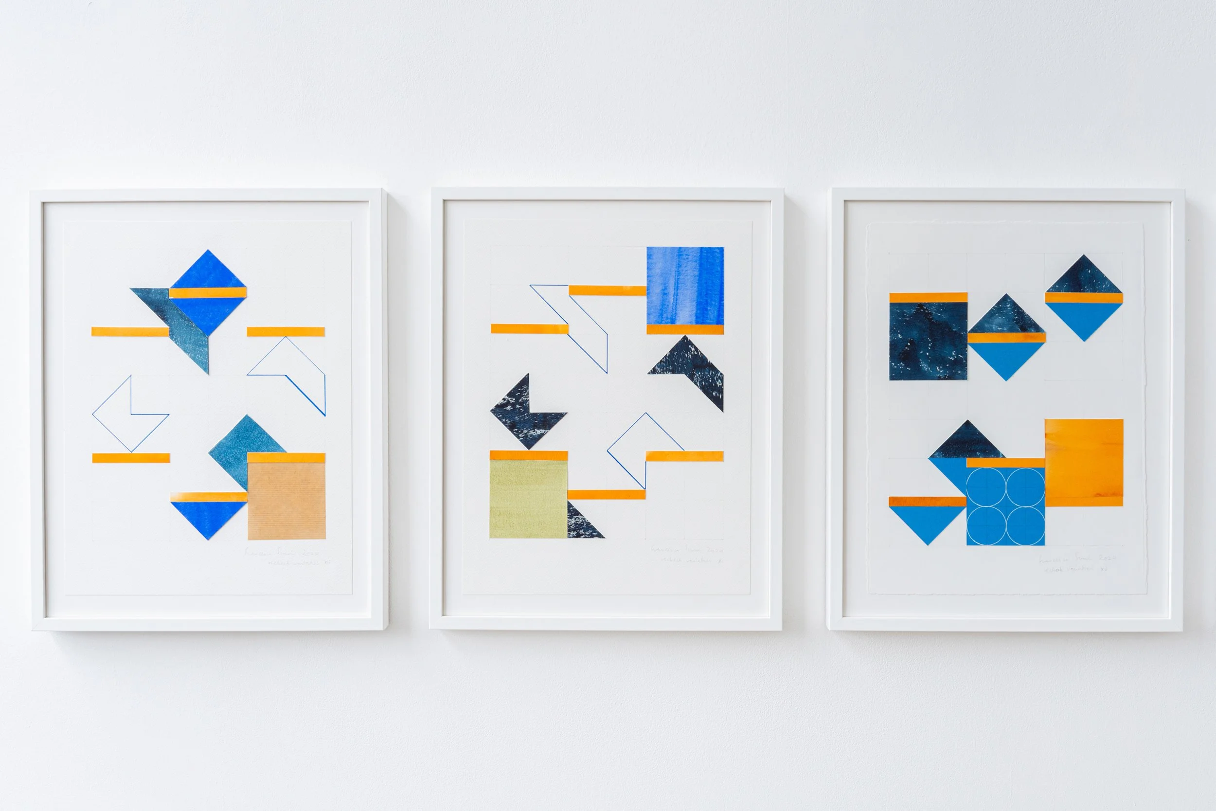
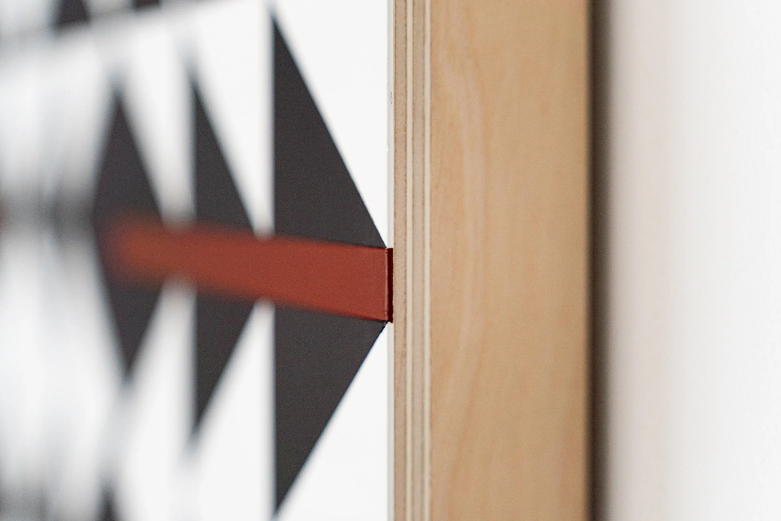
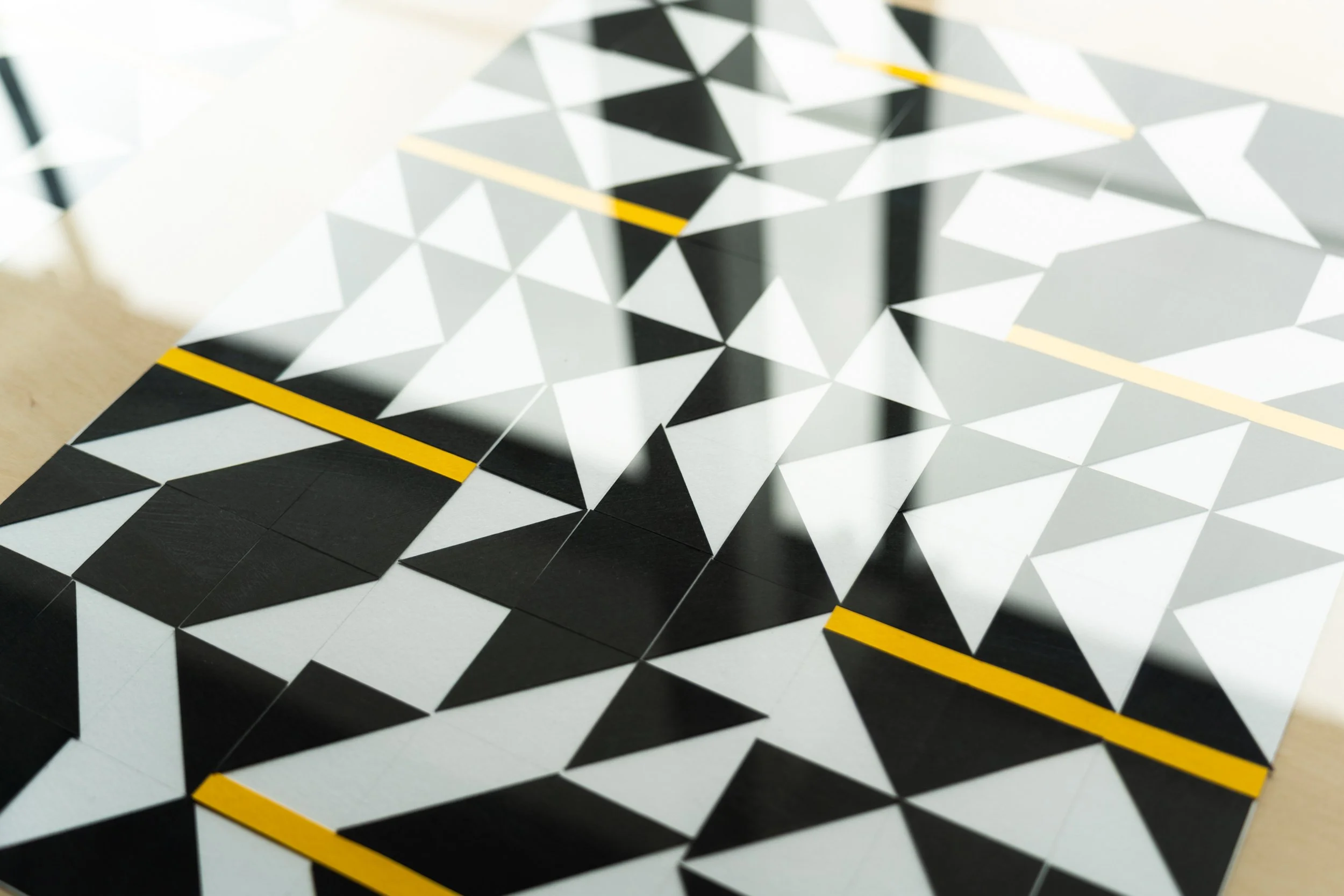
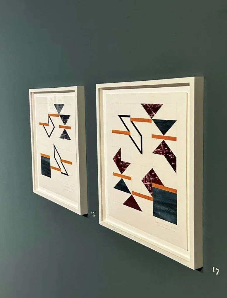
The Spaces Between is a two-part exhibition of paintings and drawings by Francesca Simon at Platform A, 8th May to 19th June 2025, and at Ryedale Folk Museum, 10th May to 29th June 2025. The body of work at Platform A, monochrome apart from dashes of colour in the horizontal bars, is a development from the work at Ryedale, strongly linked through the right-angled triangle but pushing the original geometry to more graphic forms.
Francesca Simon works from a studio in the North York Moors. The organic lines and colours of the landscape have, paradoxically, led her on a journey into geometric abstraction. While her early work focussed on the topography of Yorkshire's dry-stone walls, her work in The Spaces Between is a less direct response to landscape and the architectural forms within landscape. Her particular focus in this work includes the goaf or void remaining after the collapse of the bord-and-pillar, a feature of nineteenth century ironstone mining in North Yorkshire; and the triangles observed in Indian stepwells.
Her work is an interiorisation of landscape. She has written about a filtering process, objects seen or encountered surfacing in abstract images. Now, more than ever, geometry and symmetry are essential elements of her practice; the original visual experience is condensed into reductive abstract paintings.
Goaf Works, including the paintings cross cut, sky seam and cobalt base 1and 2, are shown at Platform A. They focus on the effects of the ironstone mining process: the mining long defunct but its effects visible to the present day.
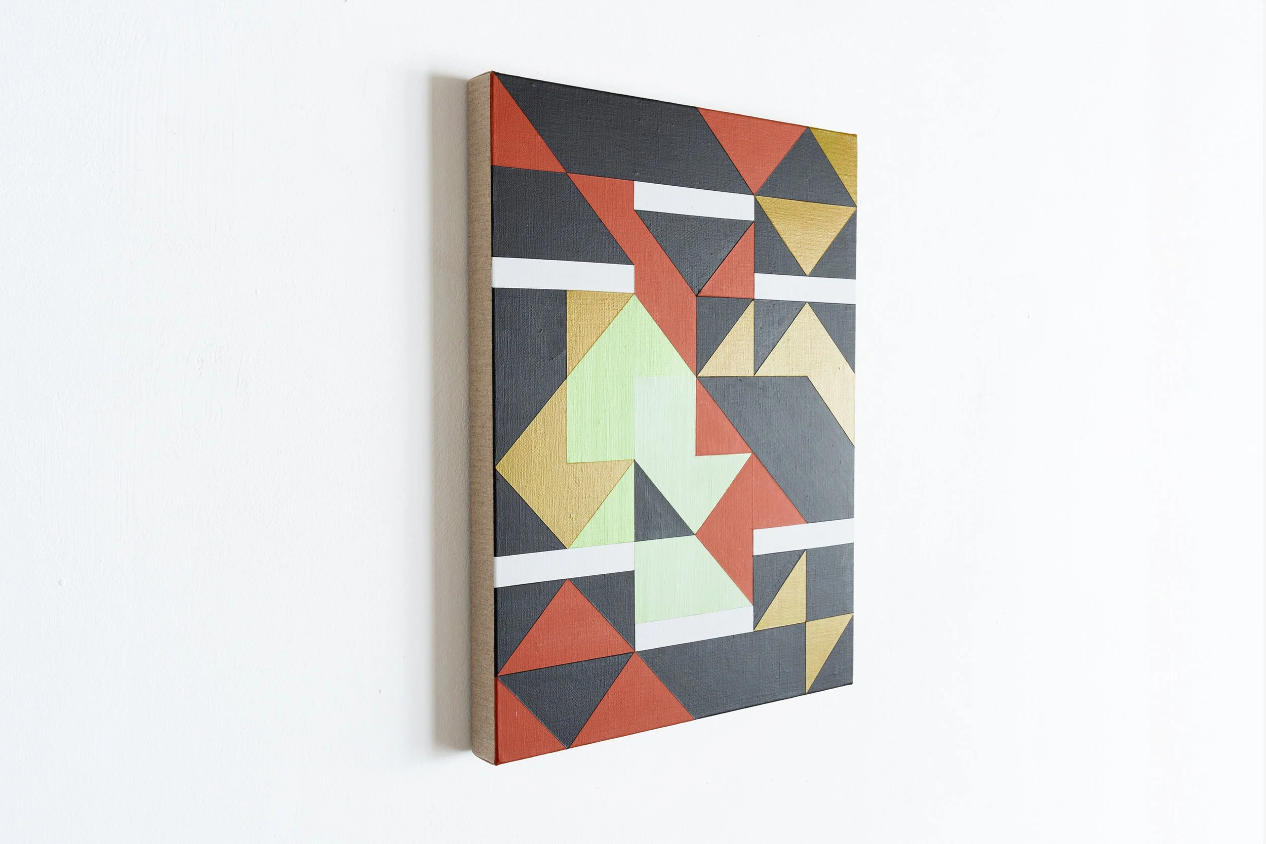
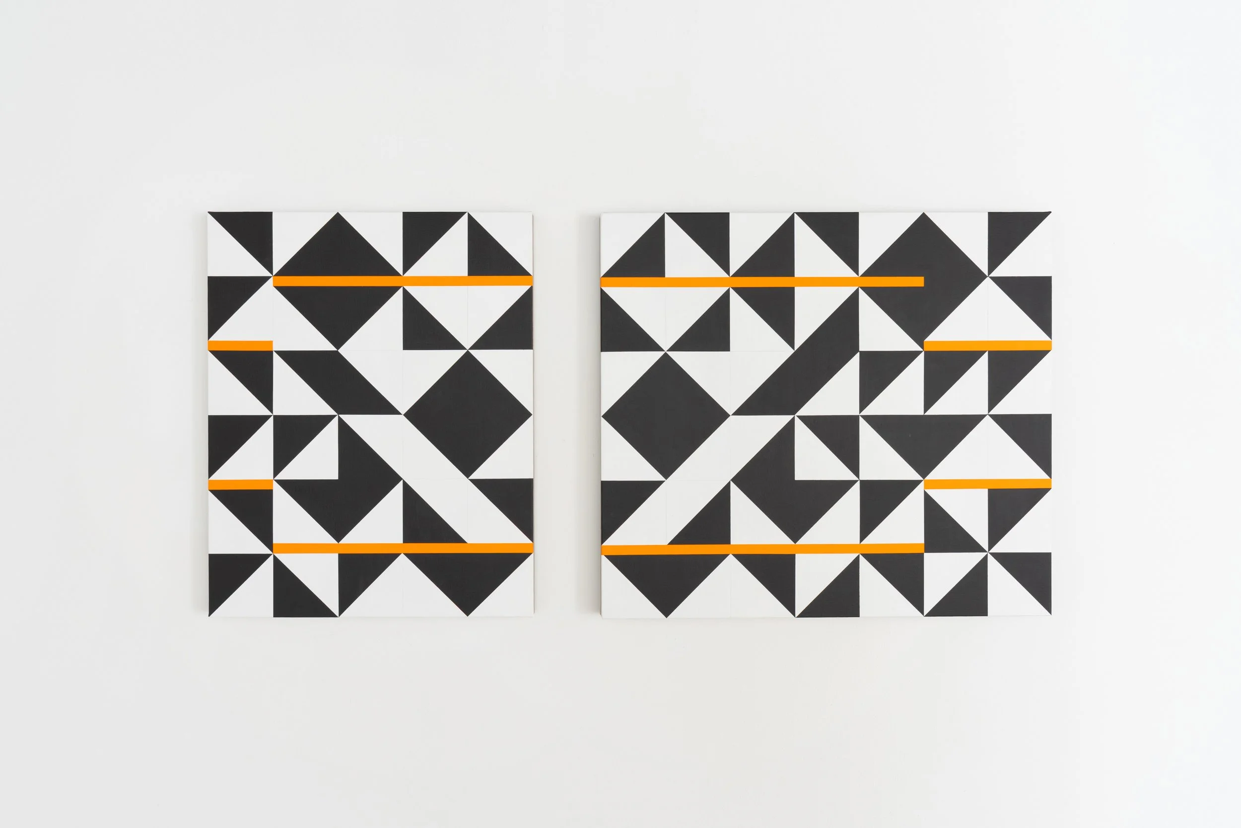
The series Check Works, mostly shown at Ryedale (apart from the diptych DOUBLE CHECK D at Platform A), are arrangements of right angled or half square triangles disrupted by horizontal bars resulting in playful, almost musical, compositions, in colours that refer to the landscape.
Photography @carolrobertson.artist
2023 BAR NOTATION, ARTSHED, GLAISDALE
Francesca Simon has recently taken the important and fruitful decision to move from painting on aluminium to linen, already sized and stretched on panels. She is now free from the arduous and complicated task of preparing the aluminium to take paint and this has opened-up new visual possibilities. Two of these panels, fraction i and fraction ii, were shown at Small is Beautiful XL, 2022, Flowers Gallery. They are both in a horizontal, landscape format with its implied reference to the sky; and the airiness and lightness of the unpainted, sized linen is immediately apparent, especially in fraction ii, with its paler colour.
In the works shown here the unpainted linen also functions more as a light-filled space than a ground, but subtly modified by their vertical portrait format. Francesca Simon has consistently played with the implications of painting formats. The only horizontal work here, DOUBLE CHECK D, is a duo marrying a left vertical panel to a right horizontal panel and brings to mind her earlier folded ‘altar-style’ panels which open up to broad landscape diptychs or triptychs.
The move from aluminium to linen is a move from a constructivist modernity with its reference to fabrication and bright reflective hardness to a softer airiness with a painterly intimacy. At the same time she continues to explore the possibilities of the concrete art combination of rectilinear and diagonal grids with a diagonally divided square, drawn with a delicate pencil line.
Into this clear simple construction she has introduced horizontal bars which lift or depress what become columns within the paintings, single, double or triple squares wide. These bars disrupt the grids in a dynamic dance and at the same time cause one to read the columns like ‘musical’ themes which are raised higher or lower in the scale, and Francesca composes them harmonically using repetition, transposition, mirroring, inversion and rotation.
This essentially musical way of thinking about form is developed in the largest and most vertical work here CHECK C in which the blue columns in the centre of the painting flicker like a concrete art version of analytic cubism or a sharp melodic vibration. As far as the experience of the work is concerned it is unnecessary to describe all the repetitions, transpositions, mirror-imaging and subtle changes of tone within the dynamic central blue zone, held between the more stable greens. They are purely visual thoughts the mind recognises directly and fluctuates between them as one’s perceptions do on a day of fleeting sunshine.
However a formal analysis of the apparently straightforward duo DOUBLE CHECK D can help reveal the mechanisms underlying the complex impact of the work. It is built from a series of repetitions which have a similar effect to rhyme and partial rhyme in poetry and reprise in music, that of returning one to a previous time or place. The two double square columns on the left of the vertical panel are repeated in the middle of the horizontal panel which, reading the work from left to right, sends one back between the panels. The prominent motif of the double square column with the two inverted large green triangles and single large blue one which is introduced by the double square blue column on the left panel is bracketed and gently held by that same column in the right panel although it is subtly varied on the far right by being mirrored through its central vertical. The divide between the panels acts like a caesura, a spatial pause but linked by the central double square across it being mirrored through the vertical while the double squares above and below it have rotational symmetry of order two. This all helps create a lovely balance within a gentle movement and creates a feeling akin to the calm clear space of a classical landscape.
Four of the works here have bars of yellow or pink which, with their horizontal form and in the historical context of the exploration of colour since Post-Impressionism, seems to introduce a notion of sunlight into the paintings, an effect reinforced by the other colours being natural blues and greens and the different tones looking like the same colour in light or shade. These ‘daytime’ paintings are joined by a ‘dusk’ painting check 6 with violet bars and an extraordinary shaft of bright light down the middle, as though a reflection from water. This shaft of light creates the illusion of crepuscular oval forms hovering within it.
Two works, early in this Check series, have burnt orange bars, a solid colour which contrasts with the spatiality of the linen and threatens to become a dominant in both the paintings by invading the triangular element in CHECK B and as a new constructing form, a triple bar, in check 2. These two paintings display a markedly different conception of harmony to the others.
Is it misleading to refer to the world in the discussion of these abstract works? This is also the case, in different ways, with other British non-figurative artists that include her friends Trevor Sutton, Carol Robertson and James Hugonin. Can one speak of a British school of Concrete Art headed by the universally loved and admired Bridget Riley in which the strict non-figurative rules of the continental concrete artists are creatively broken?
Chris Yetton, 2023
2018 LOOKING DOWN, PLATFORM A, MIDDLESBROUGH
Introduction to the catalogue for Looking Down
In the time I have known Francesca’s work I have seen it evolve from a preoccupation with landscape, particularly the grids of stone enclosures in the fields of North Yorkshire where she still works in her studio part of the time, to a more general preoccupation with the tropes of contemporary abstraction and a broader interrogation of imagery drawn from architecture, nature and the history of painting. Underpinning this has been both the ingrained doubt of the committed artist and the natural impatience of someone who values serious dialogue over and above any easy assumptions about the status of an art work or its maker.
Most interesting of Francesca’s recent discoveries, has been the visits to step wells in India, and the question implied by this, concerning space and visual architectonics. But in particular the assumption, sometimes found in post-colonial thinking and related critical theory around art practice, that the modern, geometric and programmatic is somehow a redundant stylistic idiom of (Colonial) Western Modernism. Balkrishna Dohsi and Charles Correa (Doshi studied with Le Corbusier, Correa was a vigorous and positive critic of Chandigarh) are unequivocal in writing of the adaptation of the Modernist idiom within a much older Indian tradition of space, light and geometry that they considered their own, whilst fiercely defending Le Corbusier’s influence. Perhaps this fertile remoulding of spatial ideas adapted without the fear of colonising or being colonised, is more useful to understanding contemporary abstraction than the idea of Modernism as something needing to be rejected.
A parallel association for me is with the work of Helmut Federle. One of Federle’s most intriguing projects in these terms was his exhibition in the Rudulf Steiner Archive in Dornach, Switzerland. Some of these drawings’fused grids, appearing like school geometry exercises in how to move a square through various spatial projections, combined with looser and more aleatory gestures. They seemed to sum up, in the strange locale of Steiner’s Goetheanum, an ambiguous relationship between a rational programme and a mystical one. This idea is, perhaps, what Francesca Simon is alluding to in the relationship between the paintings and drawings in this new body of work being both measured and deliberate in its allusion to the world of the folding altar piece painted on a wooden panel. Laurence Noga’s text clearly sets out the progression in Simon’s work and gives references that distinguish between legacies of Systems Art in British Modernism and the fluid approach based in material experience of space that seem to be a more accurate characterisation of what she is doing. I would add one further element (rooted in the examples given above) that I hope helps clarify what Simon’s attention to line, surface and a visual sensation of weight is doing. This is to suggest that hers is an architectural orientation. In other words ‘looking down’ means the spatial perception of the plan, just as the step well organised space to preserve access to rainwater at all levels and in all seasons. There is something deeply pragmatic about this notion, but it is also sensitive to purpose as inseparable from aesthetics or archetypes.
Andrew Bick, August 2018
2015 NAVIGATIONS, RYEDALE FOLK MUSEUM
The landscape of North Yorkshire is a major influence on my work; my painting in its current abstracted form stems in part from over 30 years spent looking at the grid patterns of the fields of Glaisdale, at the desaturated greenery enclosed by dry stone walls. The walls were built by the Navvies or navigators, hardy resourceful men, from Ireland and other parts of the British Isles; and Navigations makes oblique reference to those men. Their isolated feats of construction resonate with me as an artist, also solitary and working with my hands; their achievements, permanent monuments to their creative powers, are immeasurably impressive.
The paintings in Navigations are very different from my early paintings with their grid-like structures. They bear more resemblance, in fact, to the extraordinary dazzle camouflage techniques for shipping during the First World War, theoretically providing protection to ships navigating the Atlantic through eye-catching designs of broken planes and abutting geometric shapes. I have associated my paintings with the names of these ships through the titles I have given them.
But while the designs for shipping were about surface my work is multi-layered. Underlying stories are part of the work, sometimes highlighted in the final layer of painting, often visible through it, sometimes camouflaged by the final design.
The work I have made for this show is an allegory on the subject of navigation, through life and creativity as through the landscape and its gradual changes. Navigations is about personal and artistic exploration, about finding a way, literally and metaphorically.
2014 SITE LINES, BEARDSMORE GALLERY
Francesca Simon makes abstract paintings. Her London studio, with its long windows, lets the outside in. Far from the quiet moors of her beloved Yorkshire, with its rough stones and sunken dales, the city provides a different distraction. Just beyond the glass lies a chasm. It is the construction site for a new Crossrail addition to Tottenham Court Road Station: all men in hard hats, concrete and metal. Whereas other studio inhabitants found it too unsettling to sustain their work, Simon remained. She openly admits the difficulty in beginning to paint, saying how much the view “shook her up”. But soon she began to work alongside the site, coaxing it unawares into an inadvertent collaboration.
Key to Simon’s art is that abstraction germinates in reality, in the unearthing of something from something else. Artistic abstraction is a temporal process: from present tense in all its fullness and detail, to memory re-composed through instinct and intuition. This passage from world to thought to memory to representation behaves like a natural system. It lays bare the mind, as an x-ray does a skeleton.
Her process is curious. The artist rarely paints one work on a canvas, but rather several. Each is layered on top of the next, informing, distorting, concealing. This chronological complexity is often deliberately revealed, as in False Construct 1 where the painting underneath lies exposed – the work offering up the story of its own making. Simon seemingly wishes the canvas to open up, staging levels of impossible depth below the surface of the paint.
In paintings, such as Tunnel Vision 2 and Close Construction, rows of sharp white teeth are prominent features. They cut into the picture plane, like the serrated spade of a digger, causing violent imposition on the calm geometry. These teeth are aggressive, and, like the site outside, demand confrontation.
Francesca Simon’s canvases are dominated by the ascetic tones of metal and concrete. Across a few (Double Girder Crane and False Construct 3), however, lies the occasional slab of yellow: a rare flash of colour in an otherwise monochrome world. This is the building site, brashly announcing itself in the form of a crane, which lies always in the corner of Simon’s eye, forever journeying back and forth over its subterranean kingdom, like some imperial mantis taunting its prey. It is a powerful, clunky intrusion into the space and this is mirrored in the artworks: the yellow functioning as a thorny reminder of the outside world and its inevitable effect on the inner world, however distant or detached.
Simon’s art then is a form of excavation: an autopsy of half-remembered patterns and formations that lie sleeping in the mental cavities. While teams working on the Crossrail sites are uncovering medieval burial grounds, leftover from times of plague, her paintbrush is her shovel. Outside, there is a physical quarrying – a deconstruction – needed for construction. Inside, Simon’s art parallels this: for the artist, the act of painting is a mental archaeology, through which her art can be constructed.
Niko Munz, Site Lines, 2014
2012 TAKING SHAPE, BEARDSMORE GALLERY
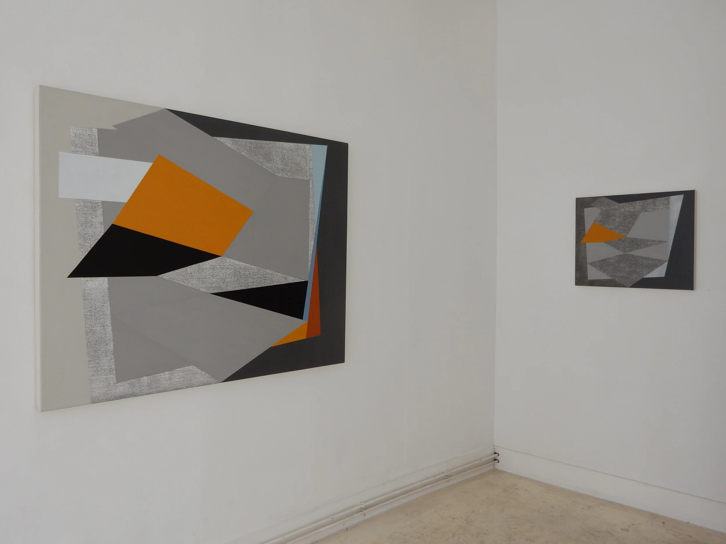
Varieties of grey abound in Francesca Simon’s elegantly minimal painting. But whether as background or form this preponderance does not in any way limit the effect of the work. Rather than being dispassionately cool, these paintings hold an energy within them that radiates outwards, suggesting an intuitive approach rather than mere mathematical precision. Attention to surface detail and to the actual disposition of form demonstrates this abstract artist’s affinity with light and, also, with implied motion. Carefully judged and balanced, her compositional forms, placed within a surrounding monochromatic ground, create portals onto a deeper space beyond, while also setting up an internal tension which animates the surrounding plane. Textural variety and interest is provided by these elements although it is only through close observation that the painstaking technique is revealed and the various complex depths of surface become evident.
Whether large or small, landscape or portrait, the rectangular format of the works remains the same, in each case framing the rhomboidal (or sometimes triangular) shapes contained within them. But on looking closely it becomes evident that each canvas is the product of much over-painting and rubbing down. The resulting geometric forms are in fact the remaining traces of an expressive under-painting which, at a later stage, has then been controlled and harnessed by the application of grey paint to determine their final contours as well as supplying the unifying background. Thus the painter’s approach entails both the making and subsequent obliteration of marks, ending only when the outer perimeter of each form is satisfactorily resolved and set in place by the use of rulers and masking tape. The grey background results therefore from painting round the edges of what is already there until the interior forms themselves take shape, getting smaller or slimmer until, as in Shards 2 (2011), they become slivers of light permeating
the surrounding space like the narrow windows of a Gothic cathedral.
The layering of paint (which can involve the application of many strata of gesso interleaved with coats of acrylic) as well as its subsequent unravelling suggests a process of excavation and betokens an unhurried commitment to time. In some cases, such as New Order (2010), traces of the changes made to the evolving forms are left behind and remain visible. Graphite is used to underline the alterations, rather than any attempt being made to obscure them. The result is a palimpsest of linear markings that adds to the pre-existing richness and archaeology of the painted textures found elsewhere. Across the group of works, generally, there is almost a reluctance to use colour but in some of the paintings, most notably in Degrees of Separation 2 (2010 –12) and Degrees of Separation 5 (2012), an array of warm khakis, rich browns, ochres and unexpected slashes of blue and lemon yellow may be found. Yet where these colours exist, it is evident that they have been severely rubbed down, their individual hues running into each other to create various veins and swirls as in a highly polished slab of marble.
Simon’s approach may be traced to a strong British tradition of constructivist painting. The geometric disposition of form, for example, brings to mind early Ben Nicholson; the degree of abstraction is reminiscent of post-War Victor Pasmore. The grey tonalities might also connect to a British geographic context – the skies of North Yorkshire and to the local dry stone walls there with which she is so familiar. But Simon’s painting also relates to more recent and international concerns within art: the emphasis on the trace and the revelation of the passage of time echo the contemporary sculptural concerns of Rachel Whiteread; the physicality of the painted marks, the calligraphic strokes of Brice Marden; the blurred effects of the internal forms connect to the technical feats of Gerhard Richter. But above all, in terms of her commitment to the discovery of form, Simon’s paintings attest to a current interest in developing the trajectory of abstract painting. To this, they provide an elegant and thoughtful contribution.
Anna Moszynska, Taking Shape, 2012
